
Project on Jumia Product Sales Insight Using Adidas and some other brands as a Case Study


A group of ten people are currently undergoing a highly productive and world-class bootcamp at Sidehustle Hustle Company in order to develop a project that focuses on a full product sales insight of a product used by Nigerians.
We achieved this following four main processes
- Web scraping
- Data cleaning
- Data visualization
- Database Creation
WEB SCRAPING AND DATA CLEANING USING PYTHON ON VISUAL STUDIO CODE
We used python programming language to scrape jumia website by following the processes below.
We used a text editor called visual studio code, which is a very versatile text editor. Since we aim at writing python codes on it, “We installed a python extension” in order to be able to run python codes on it.
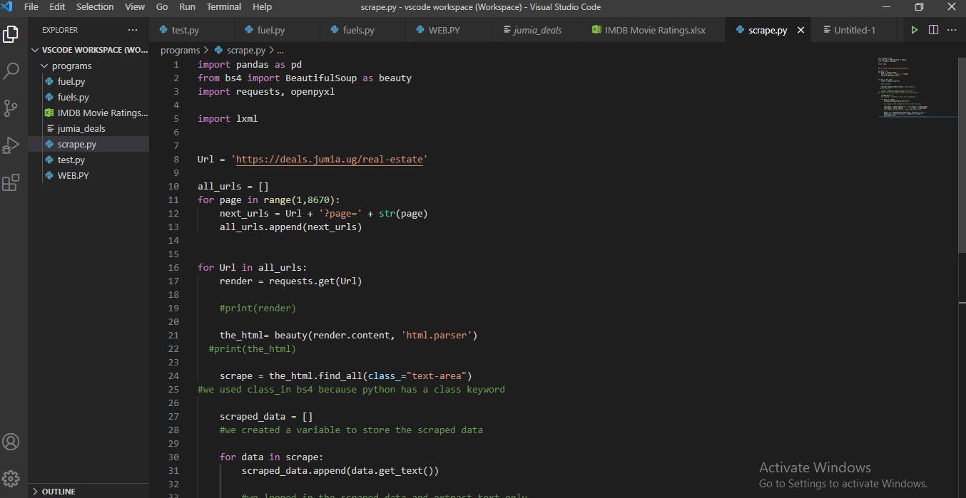
We created a file called “Scrape.py”
Since we need some python libraries like Beautiful soup, Requests, Pandas and Openpyxl for a successful scrapping, so we created a new terminal using the command prompt to install the libraries by using the format “pip install bs4”, “Pip install Requests”, Pip install pandas, Pip install Openpyxl
We then went on to write the codes that will import the installed python libraries. (Please refer to the screenshots to see the codes)
We used the requests library to pass in the html source code from the jumia website
We also created a variable for our home url, we also used “a for loop” to pick data one page at a go.
Using beautiful soup and requests let us loop through our urls and use get() from the request library to create a connection and read the url.
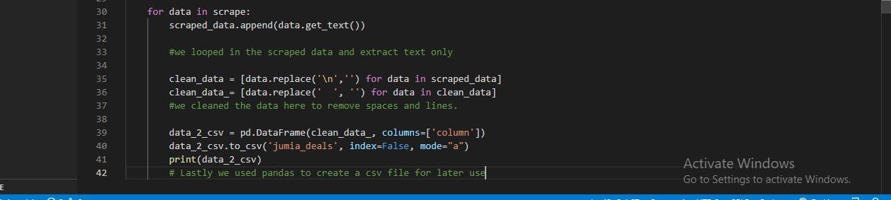
We used pandas to save the script as a csv format. Please kindly go through the codes in the screenshot, we have used the # attribute to give proper explanation to all our steps for easy understanding.
ANALYSIS ON PYTHON SCRAPED FILE USING MICROSOFT EXCEL
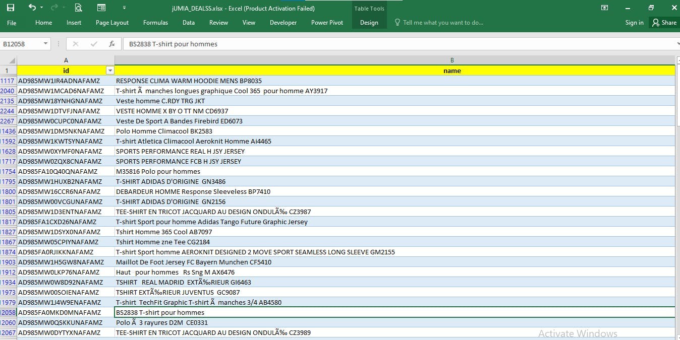
We opened the excel format of the file in Microsoft excel, then we did the following
We used ctrl + A to select everything and used ctrl + T to make everything turn into a table format for proper analysis
We then discovered that there are very many blank spaces in the data, hence we had to use Ctrl + G to fill the the blank spaces with “0”
We also applied some functions like conditional formatting, find and replace all with ctrl +f and then we used the lookup function to look up a particular brand “Adidas” for proper consideration.
We ensured the data had some proper level of cleaning in excel before doing more complex cleaning using power Query in power Bi.
DATA MODELLING WITH MICROSOFT EXCEL
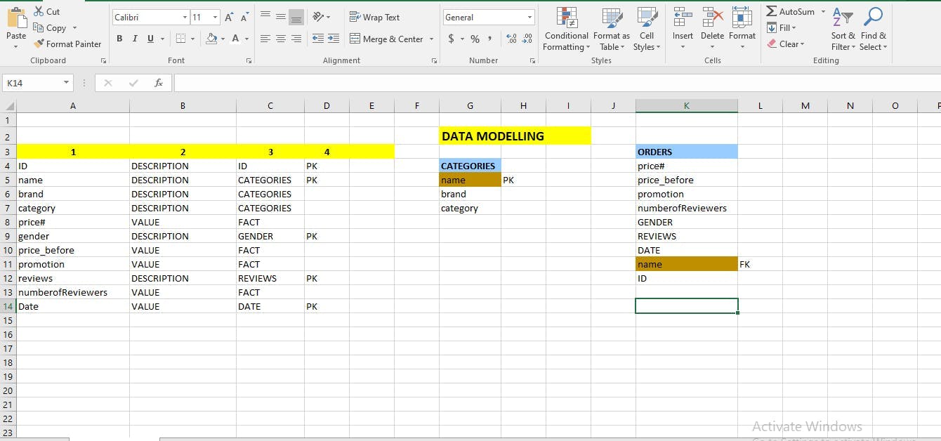
We used excel to create some data modelling so that we can have a properly defined and ordered data for use and analysis. We also did this modeling so that we can produce high quality, consistent, structured data that will help the firm we are considering to run good business applications and achieve consistent results.
The steps we followed are below:
We used ctrl + shift + right arrow to highlight the data headers and ctrl + c to copy the headers, then we used al+ E + S which a short cut of transposing values to place the headers in a vertical order.
We Grouped the columns that are not “Numbers i.e. cannot be calculated” under value and every other one under descriptions.
We then group the common columns into one table, identified some columns that ought to stand alone, e.g. date etc. then we later referred to the values as “facts”
We then identified the primary keys. Primary keys are parameters that uniquely identifies values or arguments in a record or column or even a table, a primary key must be distinct and cannot be empty.
We then Fetched out two tables called “Categories” and “Orders” There is a particular column called “name” which is found in both tables, hence, it becomes the foreign key in the “Orders” table, its function is to help us maintain a good relationship between our tables during the process of analysis
LOADING THE DATA INTO POWER QUERY EDITOR FOR A FINAL CLEANING PROCESS
We opened and “used” the “Get Data” feature in the home tab of power Bi desktop to access our Jumia_Deals data set which was saved in an xlsx format in the documents folder.
after getting this data, we used the “transform” button to load it into the power query editor for cleaning processes.
We paid reference to the data modelling we have done in excel and “duplicated” our jumia_deals dataset twice.
We renamed the duplicated dataset with regards to our modelling in excel i.e. “name1: Categories table”, “name2: Orders table”
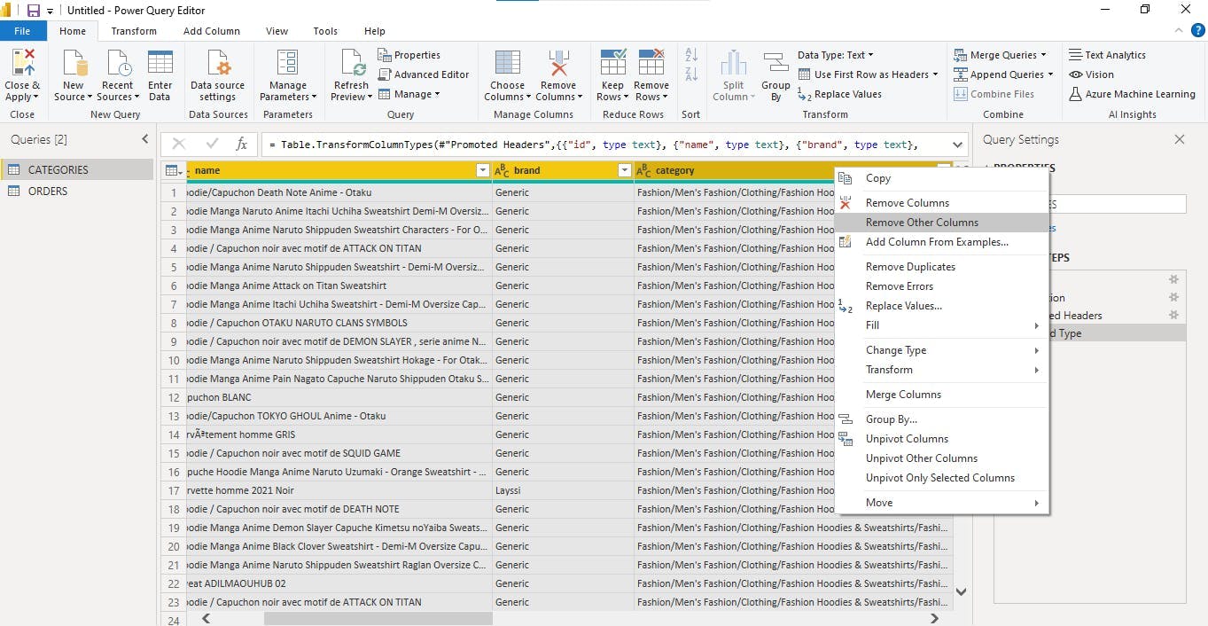
We then selected the needed columns in each table and used “remove other column” function in power Bi to remove the unnecessary columns.
We also ensured that we treated a brand for proper view and a very clear analysis insight.
After all these necessary steps we then used “close and apply all” feature in power query to load the data into “Power Bi Desktop”
CALENDAR TABLE CREATED
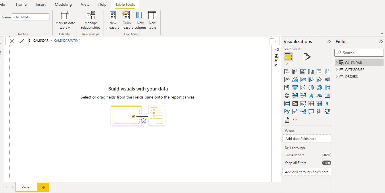
Since we have date in our data, hence, it is very important for us to create a calendar table using dax formulas in Power bi. Hence, we used the function CALENDAR = CALENDARAUTO () TO CREATE A CALENDARS TABLE.
After creating the table, it is very paramount to mark the calendar table as a date table, hence, we used the “mark table” feature under “table tools” to mark it as a date table
Then, we saw it as an important task to extract the month, year and quarter from the calendar table so that our analysis can be date using time intelligence functions.
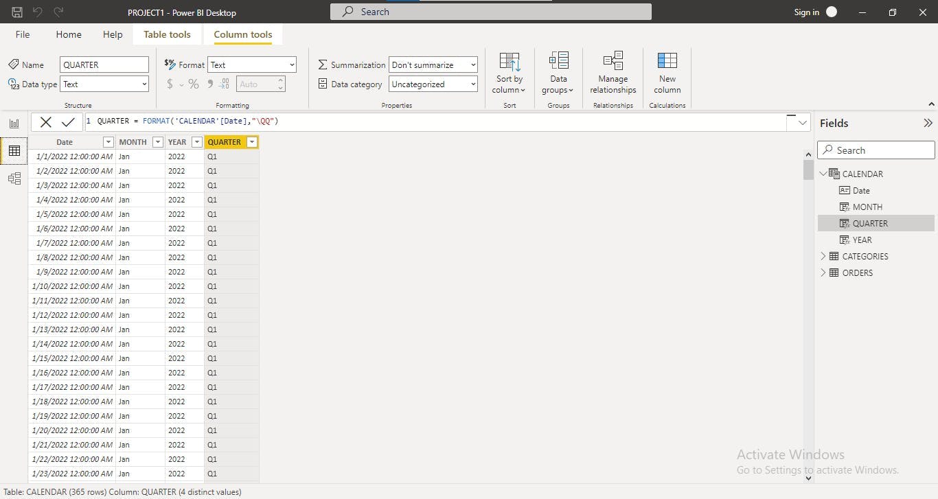 Note: We used the dax formula “Year=format (tablename,” yyyy”) to extract the year. Month=format (tablename, “mmm”) to extract the month and Quarter= format (tablename, “\QQ”) to extract the quarter.
MEASURES CREATED
We created some measures that will help us have an insightful analysis and conclusions that will affect the firm’s decisions positively
Some of the measure we created are as follows:
Total Categories using the dax formula =Countrows(table name)
Total Orders using the dax formula = Countrows(table name)
Total Sales Price using the dax formula = Countrows(table name)
PRE_MTH = CALCULATE([TOTAL_ORDERS], PREVIOUSMONTH('CALENDAR'[Date])) CENTRAL_ORDERS =
CALCULATE(ORDERS[TOTAL_ORDERS],ORDERS[gender]="Female")
ORDERS VS CENTRAL = [TOTAL_ORDERS] - [CENTRAL_ORDERS]
% Male = DIVIDE([Male],[TOTAL_ORDERS],0)
MODEL VIEW OF DATA TABLES PROPERLY FIXED
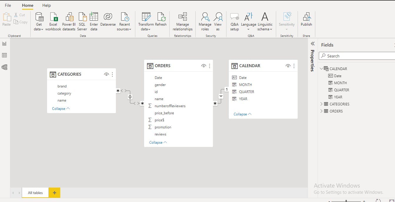
We looked into our Model view which is just below the data view at the extreme left of power bi desktop. We discovered that we need to ensure that the tables are related or else it will affect our analysis on the visual view.
So, we connected the Orders Table to the Categories table by dragging “name column" from orders table to categories table. It is the Foreign key based on the modelling we did earlier on in excel.
We also dragged the date column from the Orders table to the Calendar table, hence, they are now all related.
With this properly done, we did not have any relationship issue in our Analysis
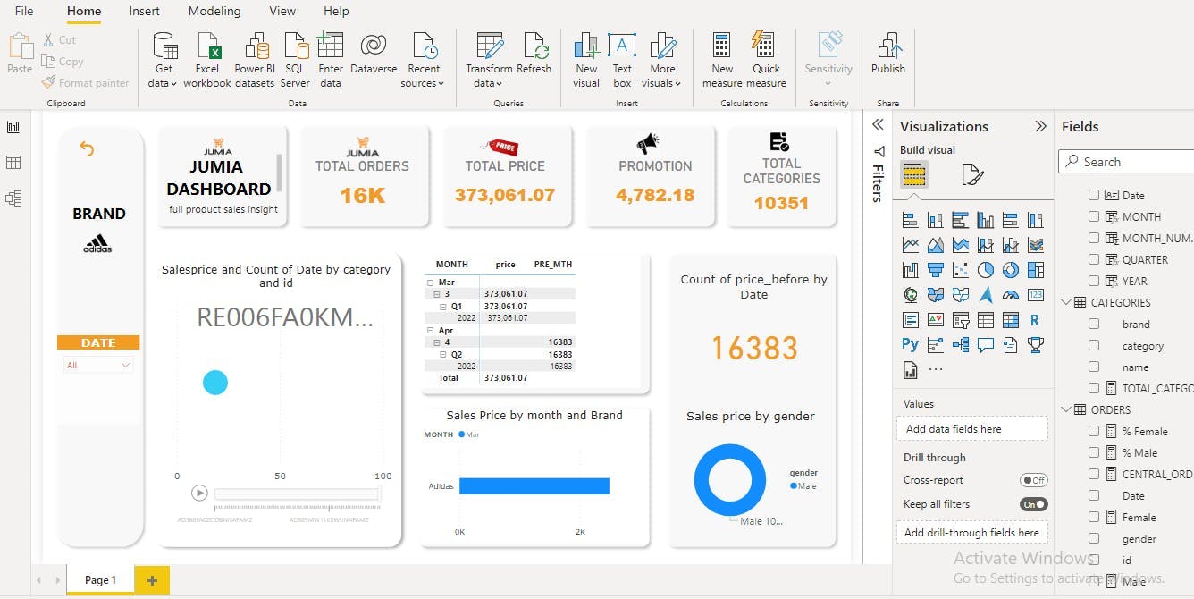
POWERBI DASHBOARD CREATED
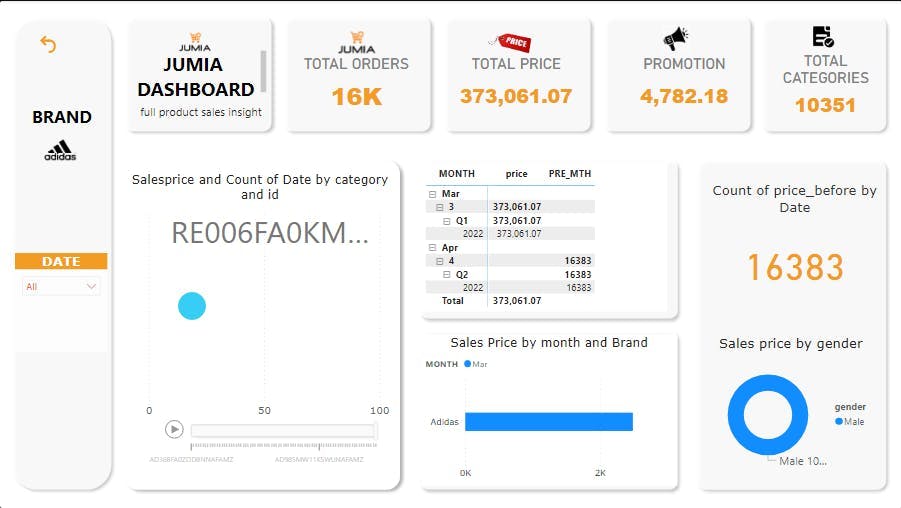
This is a Jumia Full product sales insight dashboard Using Adidas as a case study
Firstly, we would like to say that we were very careful about not using too many colors, irrelevant colors, irrelevant charts or any how fonts, we were very specific and careful about crossing our t’s and dotting our I’s.
ANALYSIS :
- We were able to show the Total Orders that was made in year 2022 and the month of march by Jumia Company. 2.We were able to also show the total Sales price of of the same year and month so that insightful recommendations can be made after analysis
3.We were able to show the total promotions, total categories (we got this by using a dax formula which is a measure)
4.We Were able to show The Sales Price count of date by category and by their distinct id’s using a “Scatter Chat” where the play axis is the id. On clicking on this play axis, it will begin to display in an orderly manner.
- We were able to show Using a Matrix table, Sales Price by month and by the previous months. (This previous month was gotten using a dax formula in the measures as explained above under step 6)
6.We were able to also show the Sales Price by brand (Adidas) and Month using a Stacked bar chart.
We showed the Count of Price by Date using a KPI
Lastly we showed Sales Price by Gender(Male) using a donut chart.
RECOMMENDATIONS:
This analysis shows that not up to an average of male order Adidas product from Jumia, so we recommend that jumia reduces their price on a monthly basis to an affordable rate.
We recommend that Jumia should try to be consistent with their prices on a monthly basis, because looking at the price of the previous month compared to that of march there is a big difference and this can discourage customers.
We also recommend that jumia should increase their promotions as they reduce their price to a very affordable rate.
EXCEL DASHBOARD
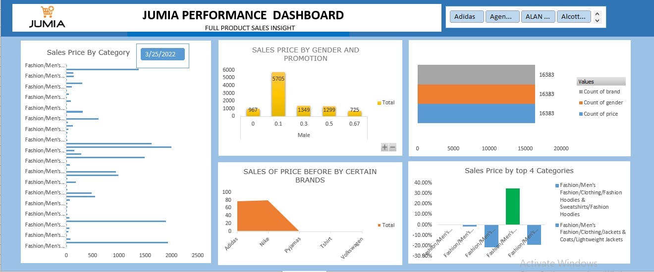
This is a Jumia Full product sales insight dashboard Using Some brands as a case study
Firstly, we would like to say that we were very careful about not using too many colors, irrelevant colors, irrelevant charts or any how fonts, we were very specific and careful about crossing our t’s and dotting our I’s.
In order to build the Above, excel dashboard we took the following steps
We selected our dataset with ctrl + A and used ctrl + T to make it a table then we used alt + N + V to create a pivot table in a new worksheet
After creating this pivot table, we then put the needed fields into either values, rows or columns
Then we selected a pivot chart for each of the charts.
- For each of the charts we created, we had to just copy and paste the first pivot table, change the fields, values and columns and choose a suitable chart.
ANALYSIS:
- We were able to show the sales price by several categories and use a date slicer that is connected to only this chart.
2.We were able to show Sales price by Gender and promotion
- We were also able to show the Sales Price before by only 5 brands that are commonly used by Nigerians
4.We were also able to show the sales price by the top 4 categories.
RECOMMENDATIONS:
We recommend that Jumia should try to be consistent with their prices on a monthly basis, because looking at the price of the previous month compared to that of march there is a big difference and this can discourage customers WE CREATED A DATABASE IN POSTGRESQL SO THAT WE CAN KEEP OUR DATA SAFE AND WRITE SOME NECESSARY QUERIES FOR FUTURE PURPOSES
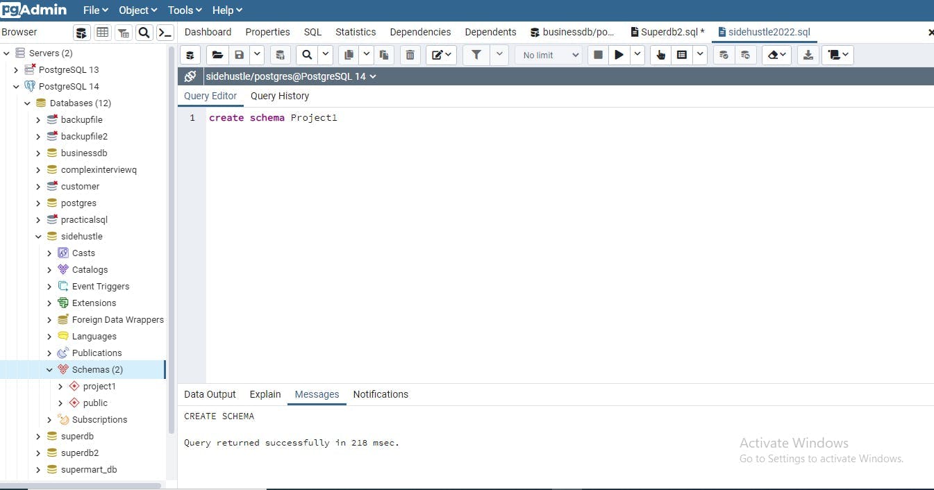
Lastly we created a database(warehouse) using Postgres by writing some sql programming languages.
The procedure we followed :
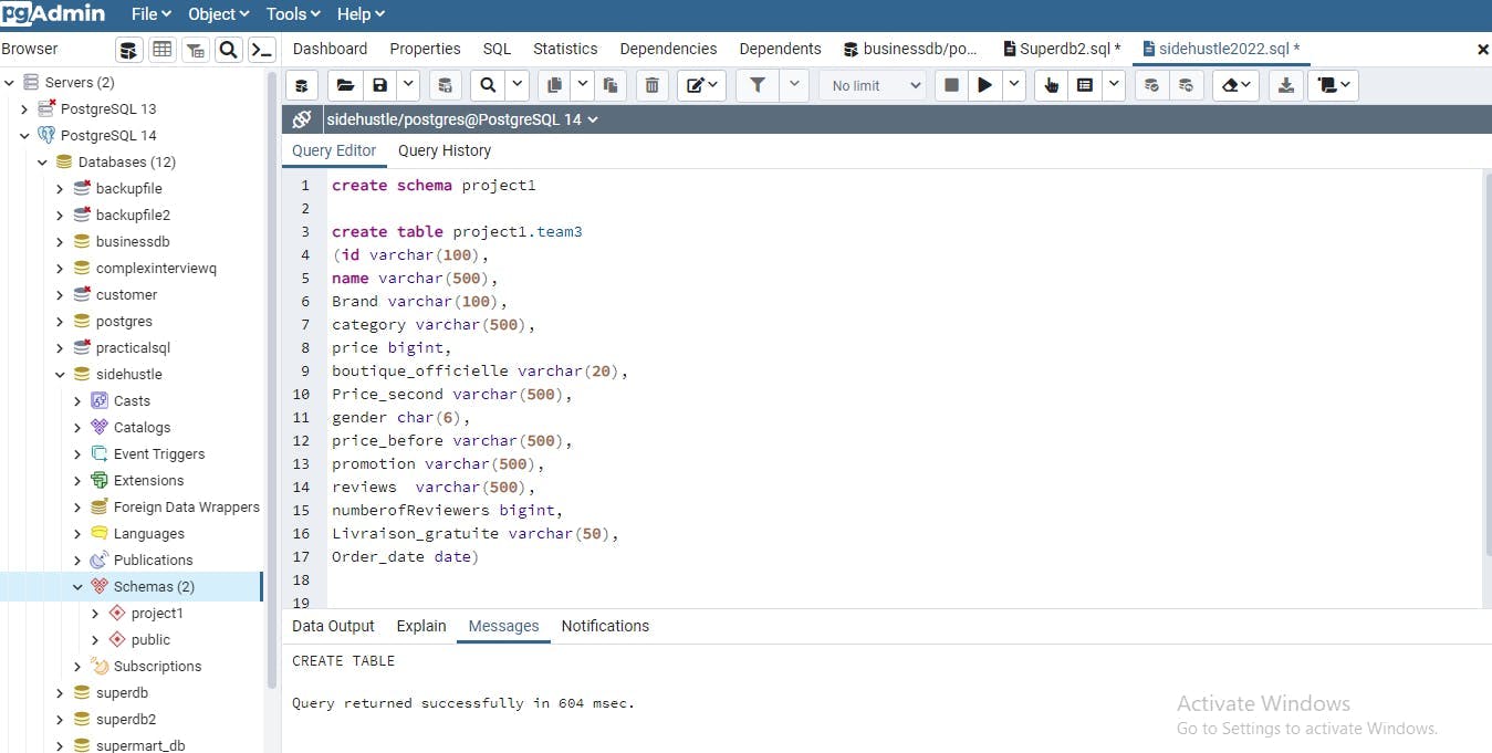
We created a database in PostgreSQL using the sql statement “Create database database name” note: the database name is sidehustle
We then created a schema so that our projects can be properly arranged by using the sql statement “Create Schema project1”
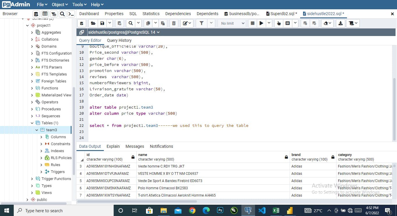
We then created a table using sql statement (please look at the screenshot for this) note: the table name is team3
After that we went ahead to save our excel file in a csv format so that we can import it into sql.
4.Lastly we then right click on our already created table, clicked on import to bring in our table.
Finally, we wrote an sql statement that will show us our imported table Select * from project1.team3
Note: * means all in sql.