

It has been a wonderful six weeks experience at sidehustle bootcamp, we have really been groomed and just like raw gold we have gone through the fire and ready for use. It feels like it's the end but it's actually just starting. For we the bootcampers it calls for a moment of reflection. As usual every Sunday we await @drey to come along with his almighty task and he sure never disappoints.
Work on a Life Expectancy Insight Analysis on a selected country. Your analysis should answer the following questions.
Does various predicting factors which has been chosen initially really affect the Life expectancy?
What are the predicting variables actually affecting the life expectancy? Should a country having a lower life expectancy value(<65) increase its healthcare expenditure in order to improve its average lifespan?
How does Infant and Adult mortality rates affect life expectancy?
Does Life Expectancy has positive or negative correlation with eating habits, lifestyle, exercise, smoking, drinking alcohol etc.
What is the impact of schooling on the lifespan of humans?
Does Life Expectancy have positive or negative relationship with drinking alcohol?
Do densely populated countries tend to have lower life expectancy? What is the impact of Immunization coverage on life Expectancy?
Step 1 : Download data here : kaggle.com/datasets/kumarajarshi/life-expec..
Step 2 : open an empty excel file(name the file country image) then copy the year, country and population columns from the csv file you downloaded from kaggle which shows 3 columns in total and a new column called 'link' to show each country flag Download country image url : worldometers.info/geography/flags-of-the-wo..
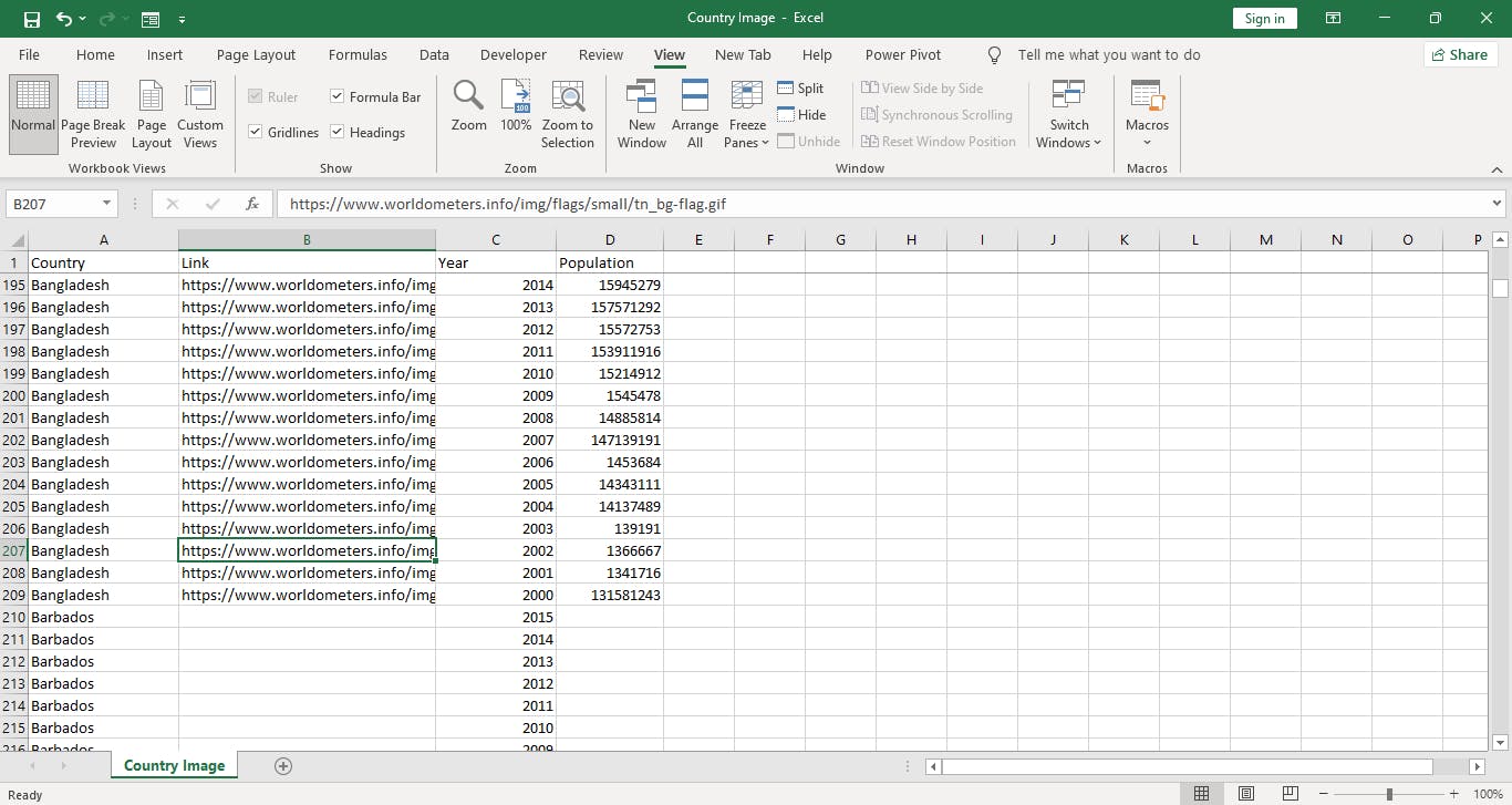
Note : we now have two csv file the life expectancy csv file from kaggle site and country image csv file ).
Step 3 : open Microsoft powerBi and import the two csv files which are life expectancy data and country image Note : click the power query to perform some Data cleansing
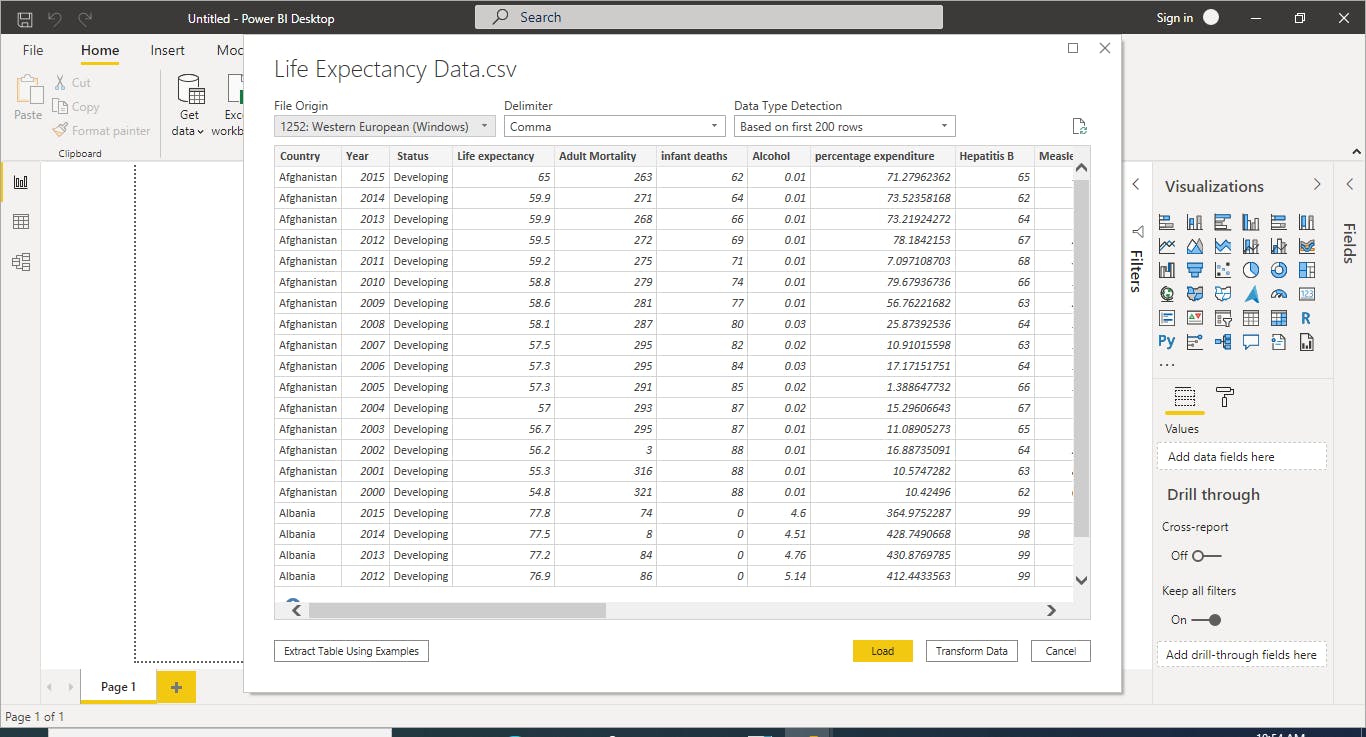
Step 4 : duplicate the life expectancy data and rename it to correlation
Then click 'run python script' Note : check the screenshot above
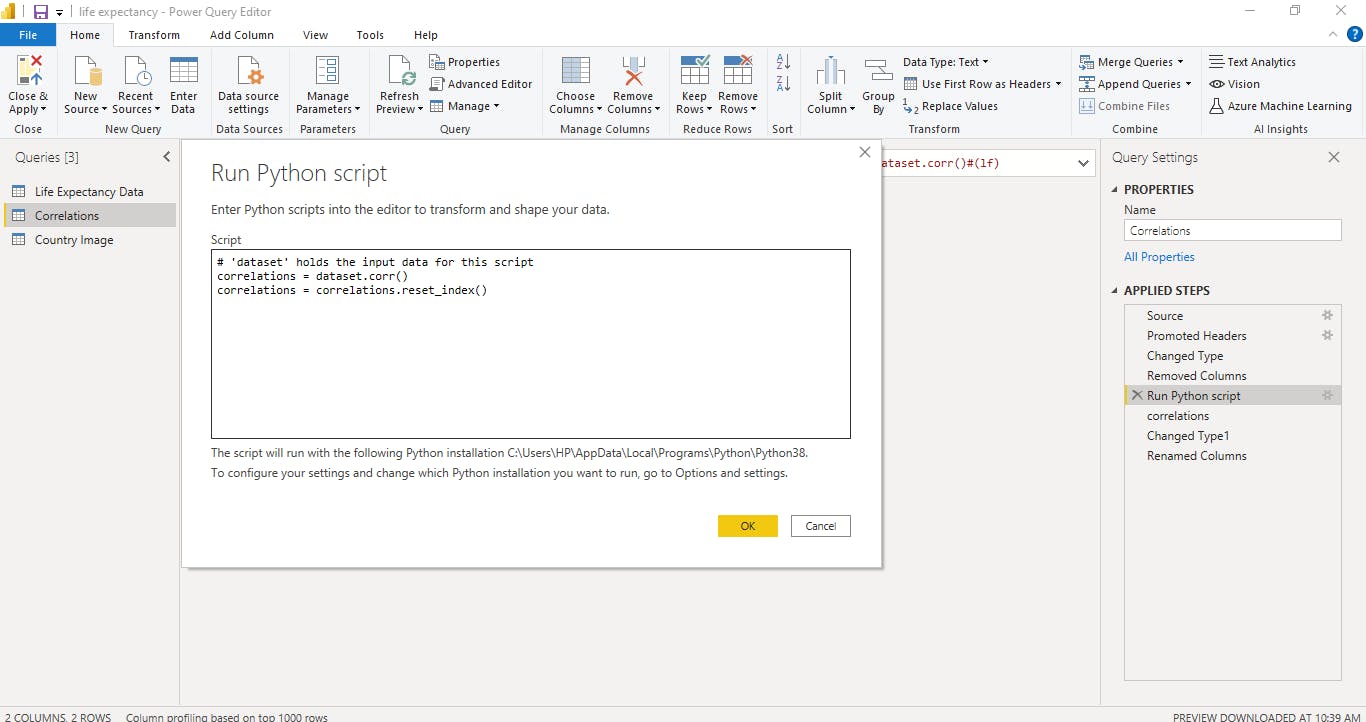 Write the above code and click 'ok'
It will show the relationship among variables (correlation)
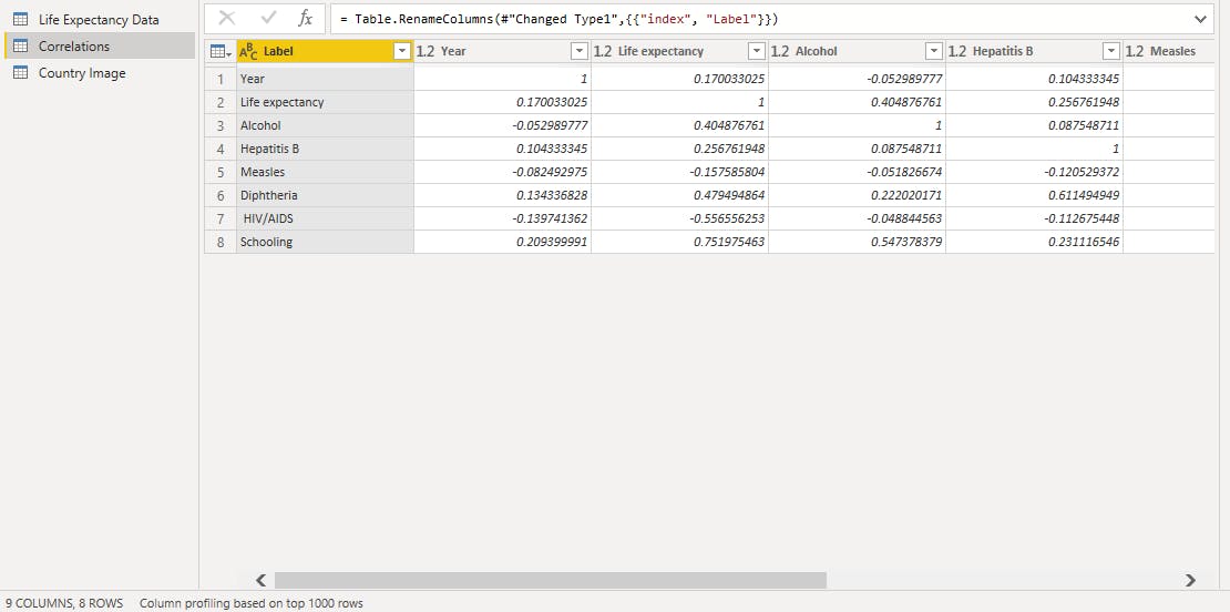
Write the above code and click 'ok'
It will show the relationship among variables (correlation)
Note : select 'close and apply' to save the above changes
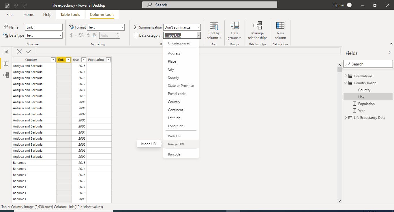
Step 5 : Go to data view and select the 'country image' data then you convert the 'link' column to image url
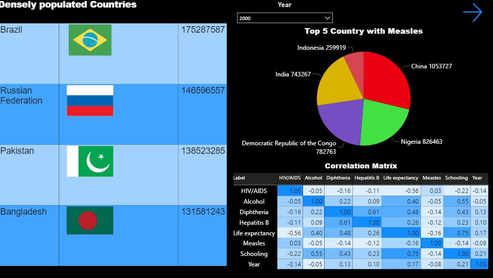
Step 6 : we showed a correlation matrix to know if there is a positive or negative relationship among the variables.
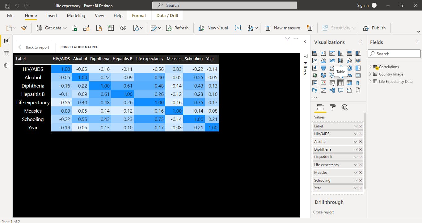
Interpretation : We observed that there is a positive relationship of 0.40 between 'life expectancy' and 'alcohol' Which means that for every alcohol consumed it will increase the life expectancy by 40%
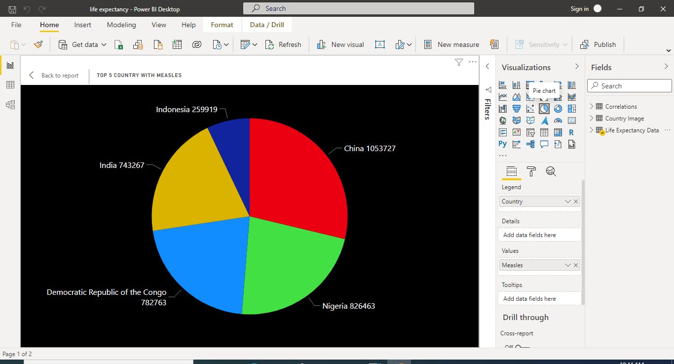
Step 7 : we also decided to show the top 5 countries with measles
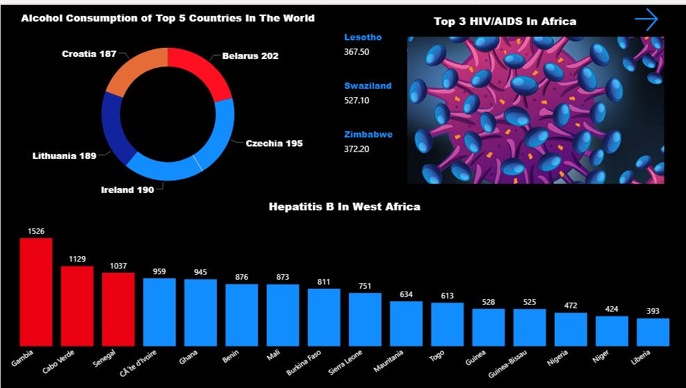
Step 8 : Which country has the highest number of alcohol consumption? , We did this using a doughnut chart
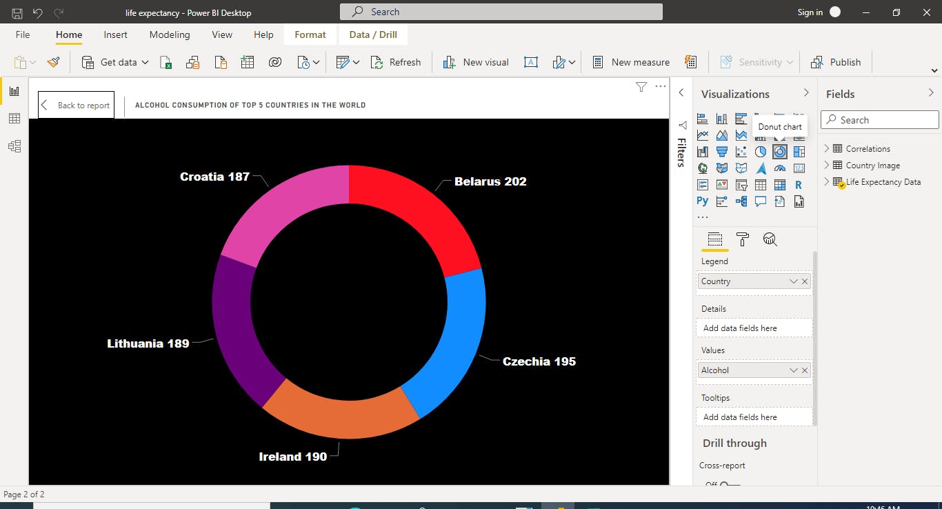
Interpretation: There is high rate of alcohol consumption in Belarus
Step 9 : now , we decided to focus on West Africa to know which west Africa country has the highest rate of Hepatitis B
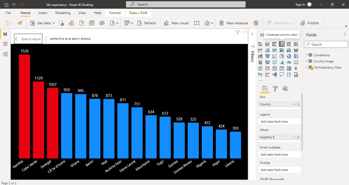
Interpretation : There are more than 10 west African country and it shows that Gambia has the highest rate of Hepatitis B
Step 10 : HIV/AIDs in Africa?
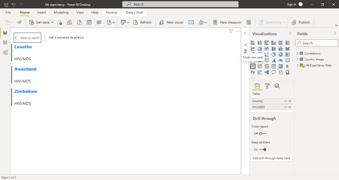
Interpretation: There are over 50 countries in Africa and it was observed that Lesotho, Swaziland and Zimbabwe have the highest rate of of HIV/AIDs
but Swaziland in particular has the highest rate
Step 11 : we created a table to show the top 4 countries with population
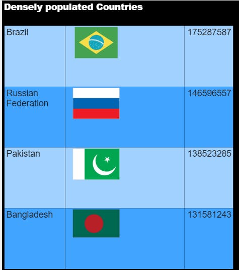
Note : add 'year' slicer from the 'country image' data so once we filter the year, the top 4 countries per year and its flag will change automatically
Full Dashboard