Global suicide rate analysis

I am a Data Analyst and also a YouTube content creator
Suicide Rates Overview 1985 to 2016
Steps :
- webscapping with python programming language
- map visual data cleaning
- map visual using powerBi
Webscapping the Global suicide rate data using Python jupyter notebook
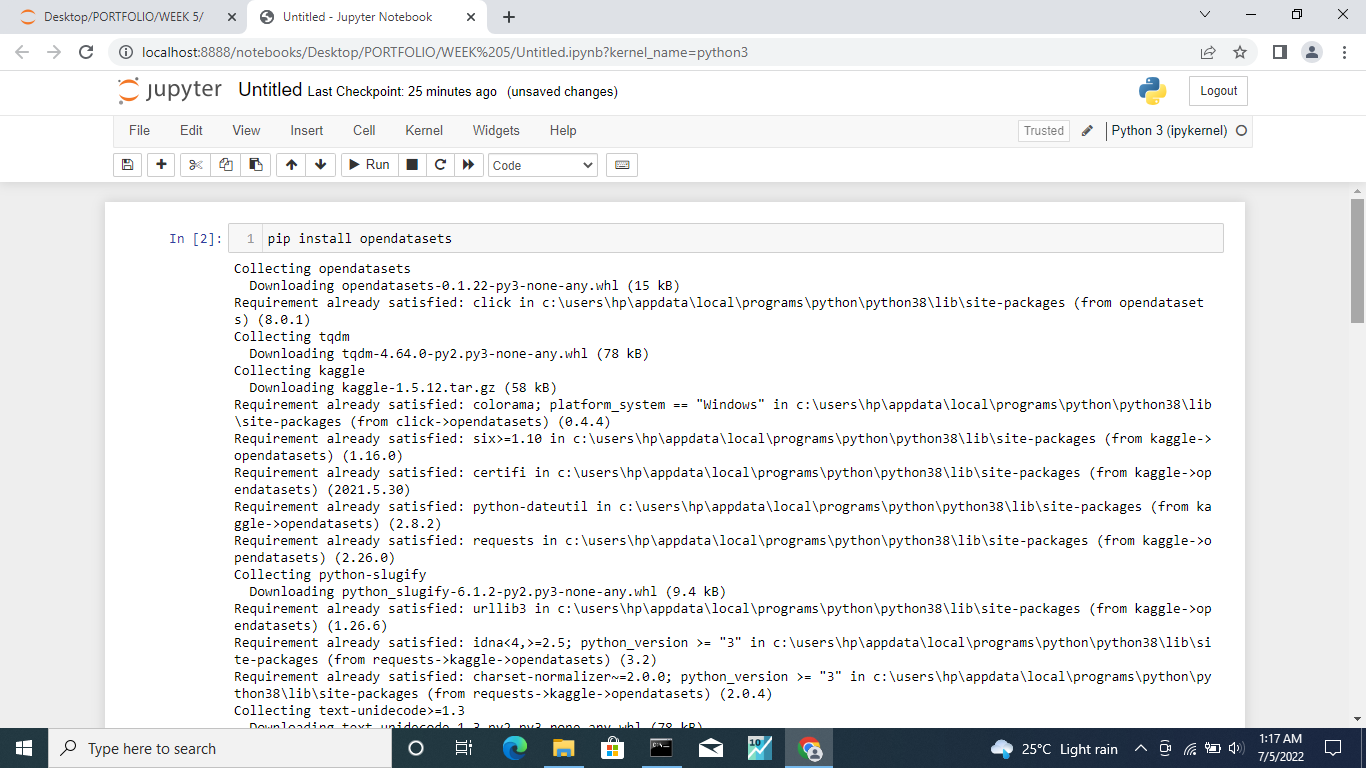
Step 1 : Create a new folder on your desktop and Download anaconda from Google Chrome and install it on your PC then you write the above code and run using 'Alt + enter key '
NB : make sure you locate the new folder you created using jupyter notebook. Folder name can be 'suicide'
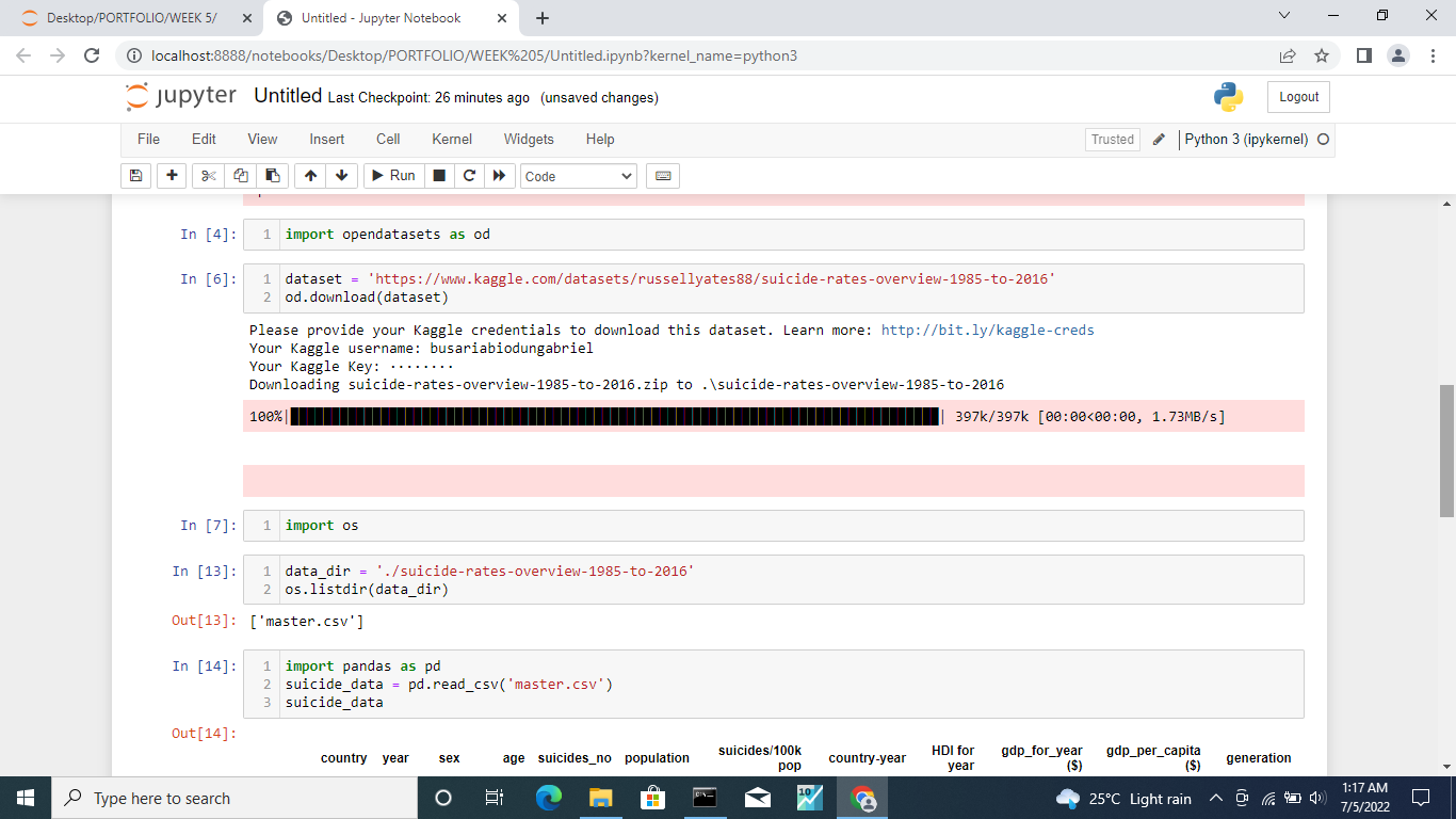
NB : also make sure that you have kaggle account in order to have access to your api key and switch on your internet connection
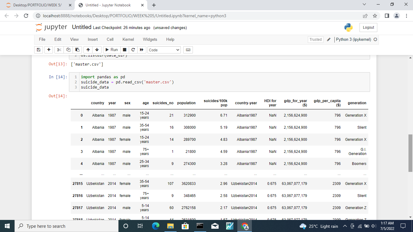
Link to suicide data : https://www.kaggle.com/datasets/russellyates88/suicide-rates-overview-1985-to-2016
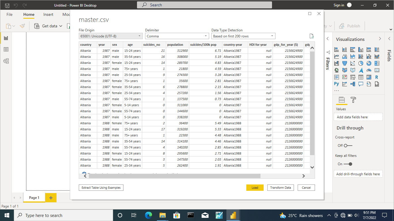
Step 2 : open your Microsoft powerBi and connect to the suicide rate dataset you scrapped from kaggle which is 'master.csv' and click the 'ok' button
Data cleaning
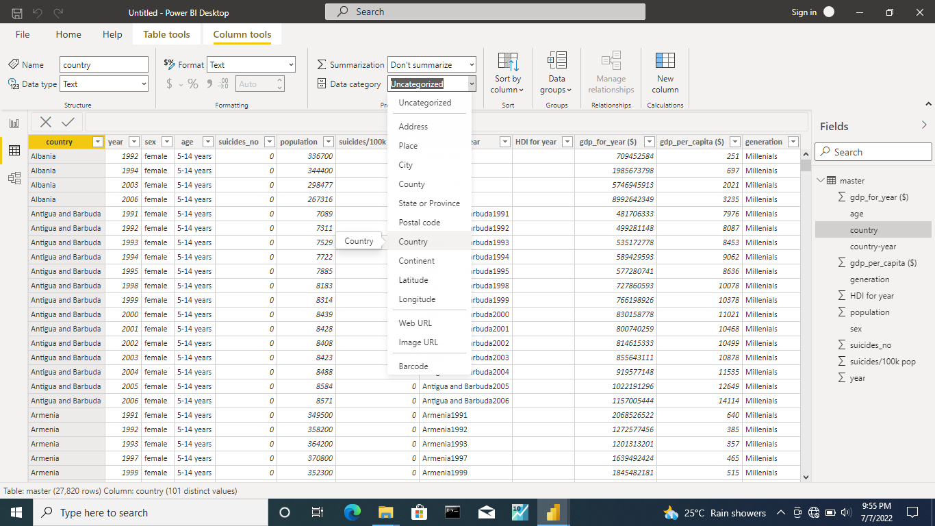
Step 3 : Go to the column tool and convert the country column data category to country for map visual
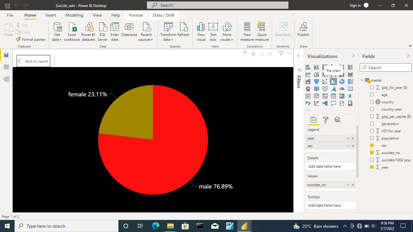
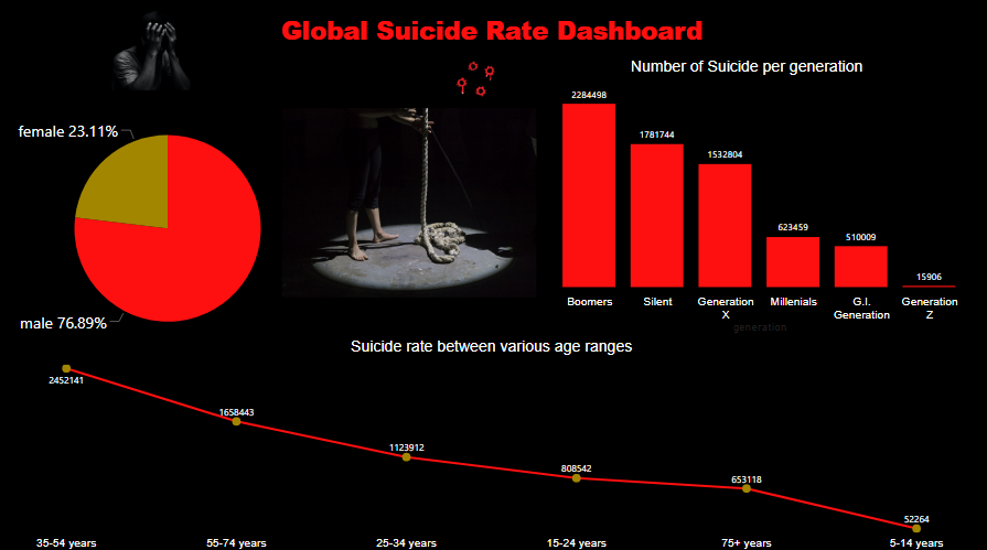
Step 4 : creat a pie chart to show the suicide rate by gender and you should notice that there is high rate of suicide among the males than the females
76.89% for males and 23.11% for females
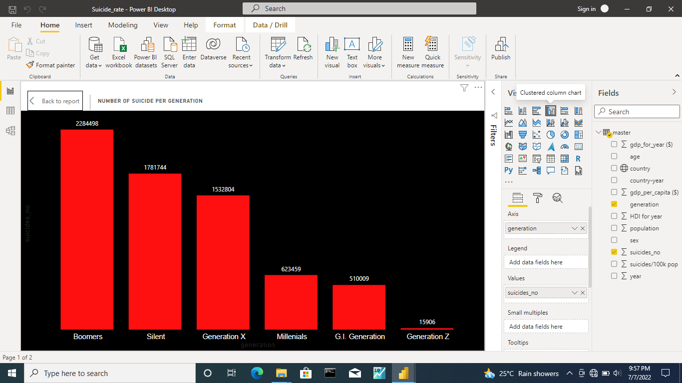
Step 5 : create a clustered column chart to show the suicide rate per generation and you can as well notice that the boomers generation are commiting more suicide than any other generation
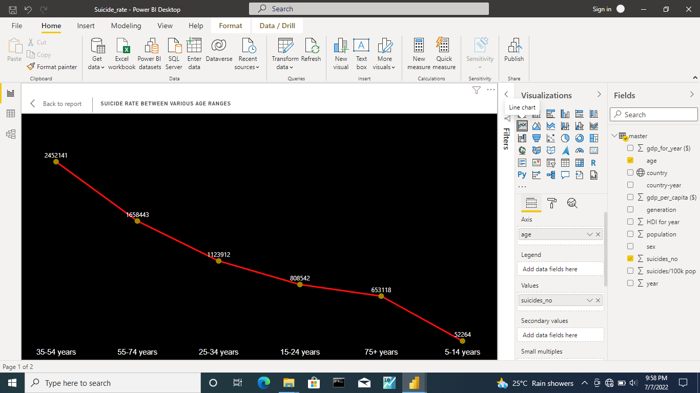
Step 6 : we also wanted to see the suicide rate between different age range so we created a line chart to depict this and we discovered that age range between 35 - 54 years old have high rate of suicide
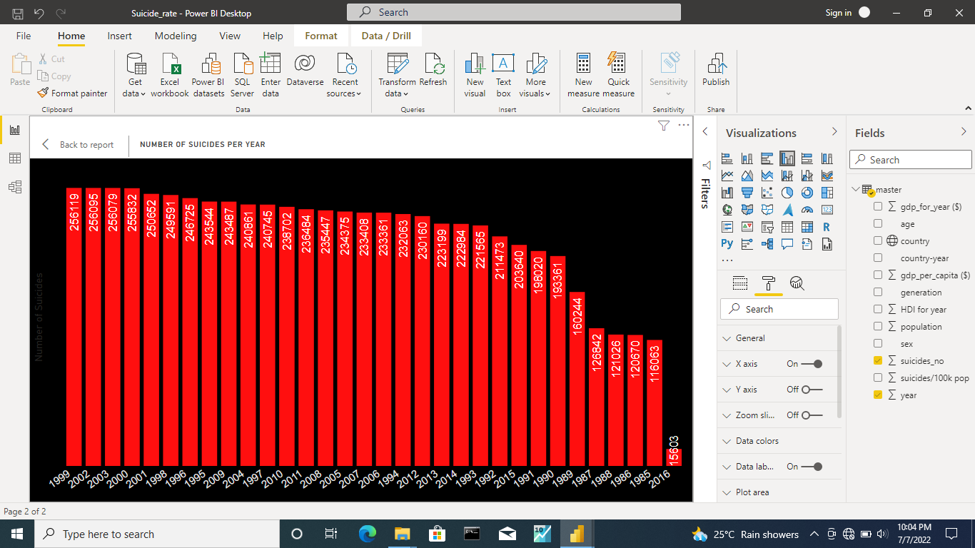
Step 7 : we decided to show the total number of suicide per year using the clustered column chart and noticed that the year 1999 has the highest number of suicide rate
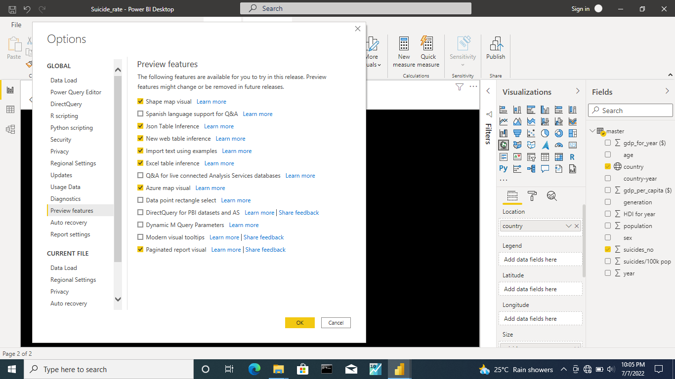
Step 8 : we created a map visual but we noticed the map won't show until we enable the above settings and restart the powerBi
N.B : click on the file tab and select option setting
N.B : save your powerBi before restarting
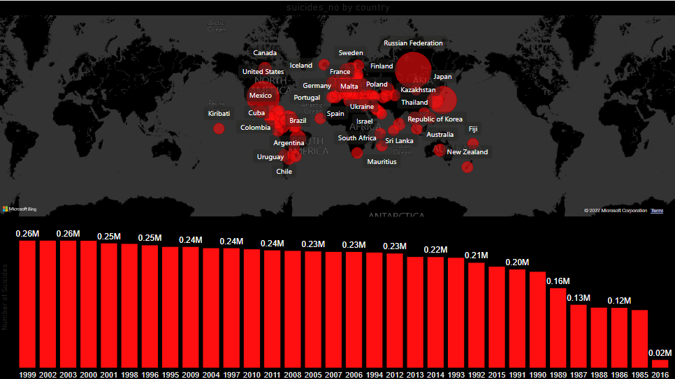
Step 9 : we successfully created a map visual to show the country with the highest rate of suicide but discovered that the Russian Federation has the highest suicide rate