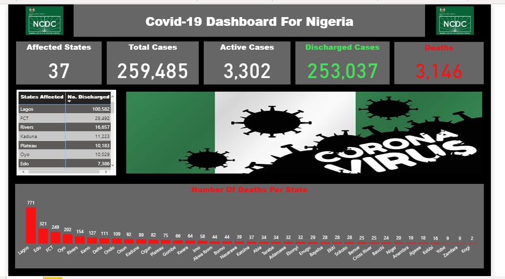
It is the second week of the side hustle portfolio boot camp and we were tasked to make a disease health analysis with specific parameters. It was quite a tasking but worthwhile journey. Getting data was not an issue, however getting data with the indicated parameters was overwhelming. We opted for Covid-19. In this article, we give a detailed analysis on the steps we took to arrive at our dataset, how it was analyzed and the visualization process. Tool : Microsoft powerBi
We got our data from the Nigeria Centre for Diseases and Control (NCDC)
Context :
States Affected
No. of Cases (Lab Confirmed)
No. of Cases (on admission)
No. Discharged
No. of Deaths
Step 1 : Webscrapping the data using Microsoft powerBi
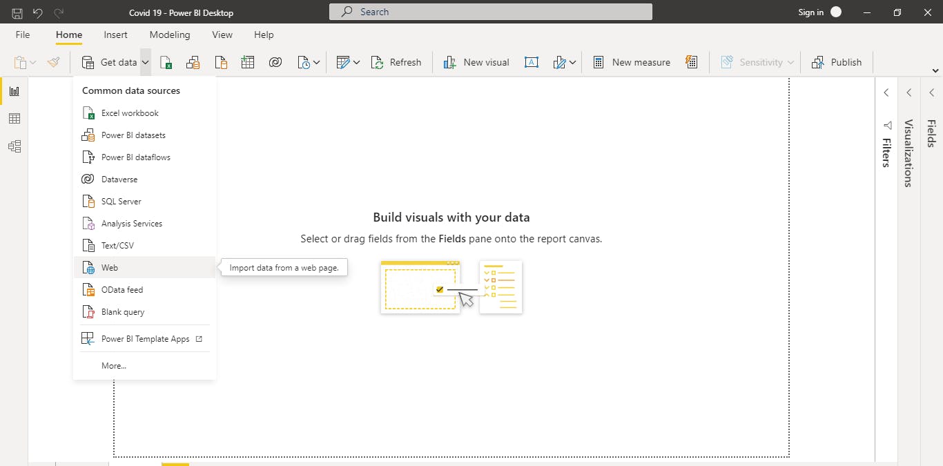
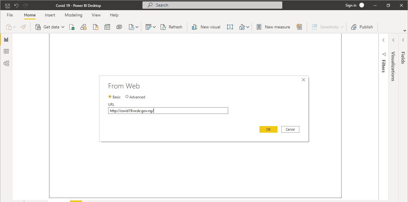
Note : make sure there is internet connection
Step 2 : Total number of affected states
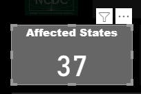 Note : use the card visual, then you drag and drop the 'affected states' column after that then you change it to distinct count
Observation : There are 37 states in Nigeria
Step 3 : Total Cases
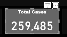 Note : use the card visual, then drag and drop the 'No. of Cases (Lab Confirmed)' column
Step 4 : Active Cases
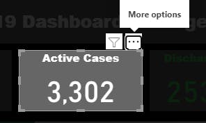 Note : use the card visual, then drag and drop the 'No. of Cases (on admission)' column
Step 5 : Discharged Cases
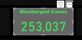 Note : use the card visual, then drag and drop the 'No. Discharged' column
Step 6 : Deaths
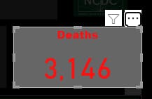 Note : use the card visual, then drag and drop the 'No. of Deaths ' column
Step 7 : Number of Deaths per state
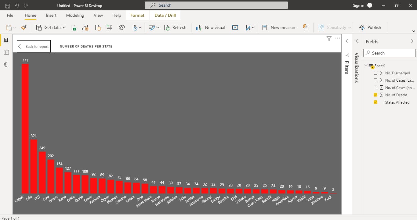 Note : use the column chart, then drag the 'states affected' column on the x-axis and 'No.of deaths' on the y-axis
Step 8 : Number of Discharged per state
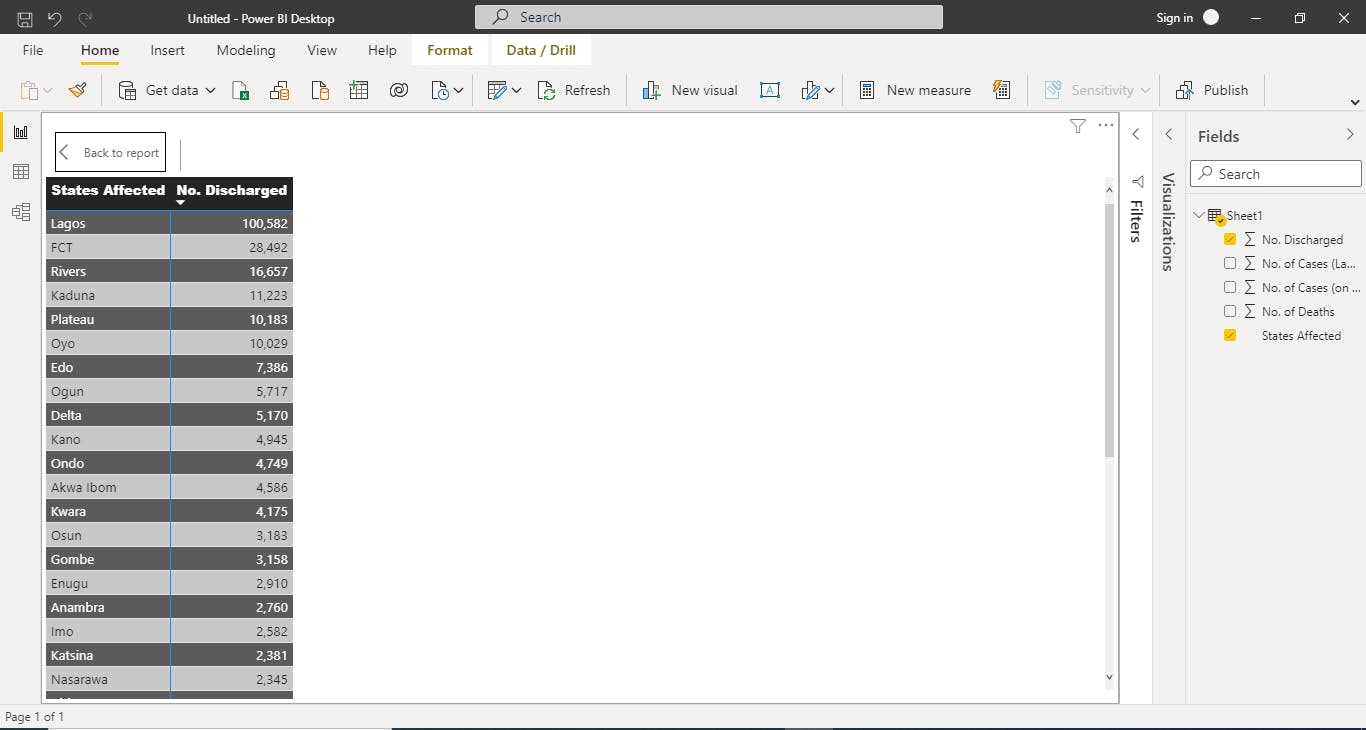 Note : use the matrix table , then drag and drop the 'states affected' column and 'discharged' column
Full Dashboard
